This pure HTML5/CSS3 animated mega menu delivers professional navigation with sleek animations while maintaining full functionality across all modern browsers. Built entirely with front-end technologies, it features a semantic HTML5 structure ensuring accessibility while eliminating JavaScript dependencies. The solution shines with its pure CSS implementation of advanced animations and responsive behaviors, automatically adapting from expansive desktop mega menus to space-efficient mobile interfaces.
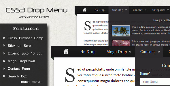
Expanded Features of the CSS3 Mega Menu
- Lightweight HTML5/CSS3 Architecture: Semantic markup enhances SEO value while CSS-powered animations reduce page load compared to JavaScript alternatives
- Dynamic Animation Effects: Choose between fade/slide transitions or hover-based transformations to match your site’s personality
- Five Theming Options: Pre-configured color schemes (dark/minimal/material/flat/modern) implemented through modifier classes
- True Responsive Behavior: Desktop mega panels transform into accordion menus on touchscreens below 768px width
- Integrated Icon Support: Font Awesome compatibility for visual indicators without image overhead
- Commented Modular Code: Well-structured CSS with clear section markers for customization like adjusting animation timing:
transition: all 0.3s cubic-bezier(0.25, 0.1, 0.25, 1); - Browser Fallbacks: Graceful degradation maintains core functionality on legacy browsers like IE8
Real-World Implementation Scenarios
Imagine an e-commerce site with complex product categories. Unlike traditional menus, our mega menu creates dedicated zones for Featured Products, Seasonal Collections, and Category Filters within its expansive panels. Content editors can display promotional banners directly in the navigation using simple HTML blocks like:
<div class="menu-promo">

  <img src="sale-banner.jpg">

  <a href="/specials" class="promo-cta">Limited Offer</a>

</div>
For service-based businesses, utilize quadrant layouts to showcase key offerings: top-left for core services, top-right for key benefits, with client testimonials and contact shortcuts in the lower section—all while maintaining consistent hover states and animation triggers.
Cross-Browser Compatibility Strategy
While modern browsers display all features, an intelligent fallback system ensures usability everywhere. On Internet Explorer 8/9, animations transform into instant reveals while maintaining: color theming, hover states, and nested list structures. This progressive enhancement approach guarantees content remains accessible, with CSS feature detection enabling transitional effects only in supporting browsers through properties like:
@supports (transition: transform 0.4s) {

  .menu-item { transition: transform 0.4s; }

}
Installation Workflow for Developers
- Link the stylesheet:
<link rel="stylesheet" href="css/megamenu-core.css"> - Add theme override:
<link rel="stylesheet" href="css/themes/flat.css"> - Implement the menu structure using semantic nav element:
<nav class="mega-container">

  <ul class="mega-menu">

    <li><a href="#">Products</a>

      <div class="mega-panel">

        <!-- Panel content blocks -->

      </div>

    </li>

  </ul>

</nav> - Adjust breakpoints by modifying the media query value:
@media (max-width: 768px) {...}
Version History Updates
- Version 1.2 (April 10, 2014)
- Improved mobile tap target sizing for touch interfaces
- Optimized box-shadow performance on animations
- Removed example contact form HTML from core distribution
- Version 1.1 (September 6, 2013)
- Fixed z-index collision issues with dropdown overlays
- Corrected tab-index sequence in mobile view
- Adjusted padding values in material theme variant
Resource Integration and Optimization
The menu integrates seamlessly with Bebas Neue as its default typography ($fa-font-path variable controls icon paths) with fallbacks to system fonts. For optimized performance:
- Compile all theme files into single minified CSS during production deployment
- Leverage CSS variables like
--mega-primaryfor centralized color updates - Replace placeholder images from Morguefile with optimized WebP or AVIF formats
When Not to Use Pure CSS Menus
This solution delivers exceptional performance for content-focused implementations, but consider alternatives like JavaScript libraries when needing:
- Dynamic menu content loading via APIs
- Advanced touch gesture support (swipe navigation)
- Sticky position constraints in complex layouts
- Real-time user context adaptations
See the complete functionality during user interaction in this extended feature walkthrough video demonstrating transitions, interactive states, and responsive transformations in action. Important Implementation Note: This is a framework-agnostic solution designed for direct HTML integration and is not provided as a WordPress plugin.