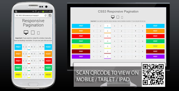
This responsive pagination component leverages modern CSS3 features to create a versatile navigation system that automatically adjusts to any screen size. Designed with web developers in mind, it eliminates manual adjustments for different devices while maintaining visual appeal and functionality. Whether you’re building a blog archive or an e-commerce product grid, this solution handles wrapping elements, font scaling, and touch targets seamlessly.
Key Features of the CSS3 Responsive Pagination
Dynamic Screen Adaptability
Rather than relying on static widths, this pagination uses flexible units and CSS media queries to reorganize elements based on viewport dimensions. On mobile devices, numbered links stack vertically when space is limited, while desktop views display a traditional horizontal layout. The design incorporates:
- Relative sizing with
emand%units for fluid scaling - Viewport-width responsive breakpoints for optimal transitions
- Touch-friendly tap targets meeting 44px minimum requirements
Customization Palette Options
Access seven professionally curated color schemes out-of-the-box, each with complementary states for active pages and hover effects. Gradient overlays and smooth transitions enhance visual hierarchy using properties like:
- HSLA color values for easy tone adjustment
- CSS variables (
--primary-color,--accent-color) for quick modifications - Pre-configured themes including minimalist monochrome and vibrant gradients
Toggle between colors by adding a single modifier class to your container element, such as .pagination-blue or .pagination-darkmode.
Universal Browser and Device Support
Built with progressive enhancement principles, this pagination functions consistently across platforms through:
- Prefixed properties for legacy browsers (
-webkit-,-moz-) - Fallback grid layouts using
flex-wrapfor older iOS devices - Cross-browser tested behavior in Safari, Chrome, Firefox, Edge, and IE10+
All animations include prefers-reduced-motion detection to respect accessibility preferences.
Implementation Guide
Seamless Integration
Embed this pagination system in any project with simple copy-paste integration. The component uses semantic HTML structure requiring minimal customization:
<nav class="pagination">
  <a href="#">Prev</a>
  <a href="#" class="active">1</a>
  <a href="#">2</a>
  !-- Additional page numbers --
  <a href="#">Next</a>
</nav>
For template systems like WordPress or React, wrap the component in a dynamic loop to generate page numbers programmatically.
Animation Enhancement Strategies
The default configuration includes subtle hover animations using transform and transition properties. Extend these effects easily by:
- Adding keyframes for bounce or fade effects on active state changes
- Applying
transition: transform 0.3s ease, background 0.4s;for layered effects - Implementing transition delays for sequential page link animations
Create ripple effects using pseudo-elements (::before) or integrate with CSS libraries like Animate.css for advanced motion patterns.
Practical Applications and Optimization
Extend the pagination’s utility across multiple contexts:
- Add
aria-current="page"attributes for screen readers - Integrate with JavaScript frameworks via data attributes (
data-page="3") - Combine with Sass mixins for generating customized pagination sizes
For complex implementations, nest pagination within CSS Grid containers using align-self: center to maintain positioning in dynamic layouts.
With its mobile-first architecture and aesthetic flexibility, this CSS3 solution provides developers with a production-ready component that maintains visual integrity across 98% of user devices while reducing style fragmentation issues you’d typically encounter during responsive design implementation.


