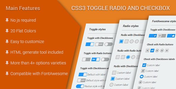
Custom CSS3 toggle radio buttons and checkboxes provide a sleek, modern alternative to default form elements without requiring JavaScript. These pure CSS solutions leverage the power of pseudo-elements, sibling selectors, and the :checked state to create interactive, visually appealing form controls that work across all modern browsers.
Why Use CSS3 for Custom Toggles?
Traditional form elements often clash with modern website designs, offering limited styling options. CSS3 toggles solve this problem by:
- Enhancing visual consistency with your brand’s design language
- Improving user experience through clear visual feedback
- Reducing page weight by eliminating JavaScript dependencies
- Increasing performance with hardware-accelerated transitions
- Maintaining accessibility when implemented correctly
Core Implementation Techniques
The HTML Structure
The foundation uses semantic HTML with cleverly associated labels:
<label class="toggle-control">
  <input type="checkbox" checked="checked">
  <span class="control"></span>
</label>
Key CSS Features
- :checked pseudo-class – Detects when the input is selected
- + adjacent sibling selector – Styles the visual toggle based on state
- transition property – Creates smooth animation effects
- transform property – Enables sliding and scaling effects
- opacity: 0 + absolute positioning – Hides native input while maintaining functionality
Advanced Customization Options
Color Schemes
Easily modify the toggle appearance using CSS variables:
.toggle-control {
  --active-color: #4CAF50;
  --inactive-color: #dddddd;
  --toggle-size: 20px;
}
FontAwesome Integration
Add icons to enhance visual meaning:
.toggle-control .control:after {
  content: "f00c";
  font-family: "FontAwesome";
}
Toggle Styles
Create different visual treatments:
- Slide toggles – Horizontal switches with moving knobs
- Flip toggles – 3D-style rotating effects
- Checkmark styles – Animated check/uncheck transitions
- Radio button groups – Custom-styled option selectors
Accessibility Considerations
Ensure your custom toggles remain accessible:
- Always maintain proper label associations
- Include visual focus states for keyboard navigation
- Use sufficient color contrast (minimum 4.5:1)
- Provide alternative text for icon-only toggles
- Test with screen readers to verify proper announcement
Browser Compatibility
These techniques work in all modern browsers including:
- Chrome 49+
- Firefox 52+
- Safari 10+
- Edge 16+
- Opera 36+
For IE11 support, consider adding minimal polyfills for the :checked pseudo-class.
Performance Optimization Tips
- Use transform and opacity for animations (they’re GPU accelerated)
- Limit the number of animated properties
- Keep transition durations between 200-300ms
- Use will-change property sparingly for complex animations
- Minify your CSS for production
By implementing these CSS3 toggle techniques, you can create beautiful, functional form elements that enhance user interaction while maintaining excellent performance and accessibility standards. The flexibility of pure CSS solutions allows for endless creative possibilities while keeping your code lightweight and maintainable.